Iklan
Pertanyaan
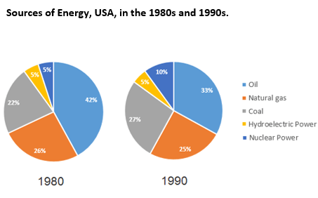
Look at the chart below and answer the question! A briefexplanation that best suits the chartis …
Look at the chart below and answer the question!
A brief explanation that best suits the chart is …
The pie charts depict the different sources of energy in the USA in two decades – the 1980s and 1990s. Around one-fourth of energy in the USA came from natural gas both in these decades. The use of oil and coal had reduced and their places as energy sources were replaced by the use of Nuclear power in the USA.

The pie charts show data on the main energy sources in the United States of America from 1980 to 1990. As is presented in the pie charts, oil was the main energy source for the USA for ten years. Around one-fourth of energy in the USA came from natural gas during this time. For ten years, the usage of nuclear power as source of energy gradually increased while the production of energy from hydroelectric power remained the same.
According to the given data, oil was the main energy source in the USA which was 42% in 1980. The second largest energy source in this decade was the natural gas which supplied 26% of total energy in the same period. Then coal supplied more than 20 percent energy demand in the USA while hydroelectric power and Nuclear power both supplied 5% of the total energy.
The Nuclear power produced one-tenth of total energy demand and that was almost doubled than it was in the previous decade. The hydroelectric power as an energy source remained unchanged as it provided 5% of total energy demand in this decade also. The other main sources of energy in the USA, coal and natural gas, remained almost unchanged in this decade. Finally, the use of oil as an energy source reduced to 33%, which was almost 10% less than the previous decade but remained the largest source albeit the reduction in this 90s decade.
The pie charts show data on the main energy sources in the United States of America for two decades. As is presented in the pie charts, oil was the main energy source for the USA both in the 80s and 90s. Around one-fourth of energy in the USA came from natural gas in these decades. The usage of nuclear power as source of energy was doubled in one decade while surprisingly, the production of energy from hydroelectric power remained the same.


Iklan
S. Selena
Master Teacher
Jawaban
jawaban yang benar adalah E.
Pembahasan
Soal menanyakan deskripsi singkat yang paling sesuai dengan gambar. Untuk menjelaskan grafik seperti ini, kita harus memahami poin-poin terpenting dalam grafik, misalnya angka tertinggi dan terendah, lalu perubahan angka-angka yang drastic atau stagnant (tidak ada perubahan). Pilihan A tidak menjelaskan salah satu poin penting dari grafik tersebut yaitu ‘minyak ( oil ) sebagai sumber energy utama.’ Lalu, 1980s artinya 1980-an dan 1990s artinya 1990-an. Hal ini menunjukkanbahwa grafik di atas menunjukkan produksi minyak selama kurang lebih dua puluh tahun bukan sepuluh tahun (dari tahun 1980 sampai 1990). 1980 berbeda dengan 1980-an. Jadi, pilihan B tidak tepat . Pilihan C tidak tepat karena hanya menyoroti produksi minyak 1980-an, sedangkan pilihan D tidak tepat karena hanya menyoroti produksi minyak tahun 1990-an. Grafik tersebut memuat data tentang sumber energy utama di USA selama dua decade (dua puluh tahun). Dalam grafik ditunjukkan bahwa sumber utama enegi USA selama dua decade tersebut adalah minyak sedangkan sekitar ¼ lainnya berasal dari gas alam. Penggunaan energy nuklir yang sebelum 5% meningkat menjadi 10 % (dua kali lipat) sedangkan listrik tenaga air tetap di 5%. Penjelasan yang sesuai dengan data yang ada di dalam grafik adalah pada piliha E. Jadi, jawaban yang benar adalah E .
Soal menanyakan deskripsi singkat yang paling sesuai dengan gambar.
Untuk menjelaskan grafik seperti ini, kita harus memahami poin-poin terpenting dalam grafik, misalnya angka tertinggi dan terendah, lalu perubahan angka-angka yang drastic atau stagnant (tidak ada perubahan).
Pilihan A tidak menjelaskan salah satu poin penting dari grafik tersebut yaitu ‘minyak (oil) sebagai sumber energy utama.’
Lalu, 1980s artinya 1980-an dan 1990s artinya 1990-an. Hal ini menunjukkan bahwa grafik di atas menunjukkan produksi minyak selama kurang lebih dua puluh tahun bukan sepuluh tahun (dari tahun 1980 sampai 1990). 1980 berbeda dengan 1980-an. Jadi, pilihan B tidak tepat.
Pilihan C tidak tepat karena hanya menyoroti produksi minyak 1980-an, sedangkan pilihan D tidak tepat karena hanya menyoroti produksi minyak tahun 1990-an.
Grafik tersebut memuat data tentang sumber energy utama di USA selama dua decade (dua puluh tahun). Dalam grafik ditunjukkan bahwa sumber utama enegi USA selama dua decade tersebut adalah minyak sedangkan sekitar ¼ lainnya berasal dari gas alam. Penggunaan energy nuklir yang sebelum 5% meningkat menjadi 10 % (dua kali lipat) sedangkan listrik tenaga air tetap di 5%. Penjelasan yang sesuai dengan data yang ada di dalam grafik adalah pada piliha E.
Jadi, jawaban yang benar adalah E.


Perdalam pemahamanmu bersama Master Teacher
di sesi Live Teaching, GRATIS!
1
2.0 (1 rating)
Ica Sifa
Jawaban tidak sesuai
Iklan

Pertanyaan serupa
RUANGGURU HQ
Jl. Dr. Saharjo No.161, Manggarai Selatan, Tebet, Kota Jakarta Selatan, Daerah Khusus Ibukota Jakarta 12860
Coba GRATIS Aplikasi Roboguru

Coba GRATIS Aplikasi Ruangguru


Produk Ruangguru
Bantuan & Panduan
Hubungi Kami

Ikuti Kami


©2026 Ruangguru. All Rights Reserved PT. Ruang Raya Indonesia