Iklan
Pertanyaan
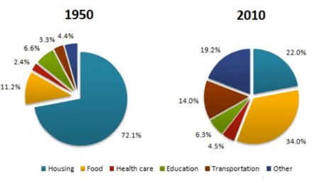
This graph for question number 7 - 8 What is the purpose of the above pie chart?
This graph for question number 7 - 8
What is the purpose of the above pie chart?
The charts show that the expenditure ratio for food soared in 6 decades while an overwhelming portion of the expenditure went on for housing in 1950.
The charts show that the bulk of the expenses in 1950 was made for the housing and food which accounted for a massive 72.1% and 11.2% of the total expenditures.
The charts show that people prioritized buying food (34%) more than housing (22%) six decades later.
The charts show that Health care had the lowest amount of money spent on in both of the years.
The charts show about the comparison among the average nationwide expenses on several household categories including housing, food, healthcare, education, transportation in 1950 and 2010.


Iklan
Y. Yuli.Widya
Master Teacher
Pembahasan
Tujuan dari sebuah data statistik dalam bentuk pie chart adalah menyajikan keseluruhan data dan apa yang disajikan oleh kedua pie chart di atas adalah perbandingan rata-rata dari pengeluaran rumah tangga yang meliputi perumahan, makanan, kesehatan, pendidikan, dan transportasi di tahun 1950 dan 2010.
Tujuan dari sebuah data statistik dalam bentuk pie chart adalah menyajikan keseluruhan data dan apa yang disajikan oleh kedua pie chart di atas adalah perbandingan rata-rata dari pengeluaran rumah tangga yang meliputi perumahan, makanan, kesehatan, pendidikan, dan transportasi di tahun 1950 dan 2010.


Perdalam pemahamanmu bersama Master Teacher
di sesi Live Teaching, GRATIS!
1
5.0 (1 rating)
Iklan

Pertanyaan serupa
RUANGGURU HQ
Jl. Dr. Saharjo No.161, Manggarai Selatan, Tebet, Kota Jakarta Selatan, Daerah Khusus Ibukota Jakarta 12860
Coba GRATIS Aplikasi Roboguru

Coba GRATIS Aplikasi Ruangguru


Produk Ruangguru
Bantuan & Panduan
Hubungi Kami

Ikuti Kami


©2026 Ruangguru. All Rights Reserved PT. Ruang Raya Indonesia